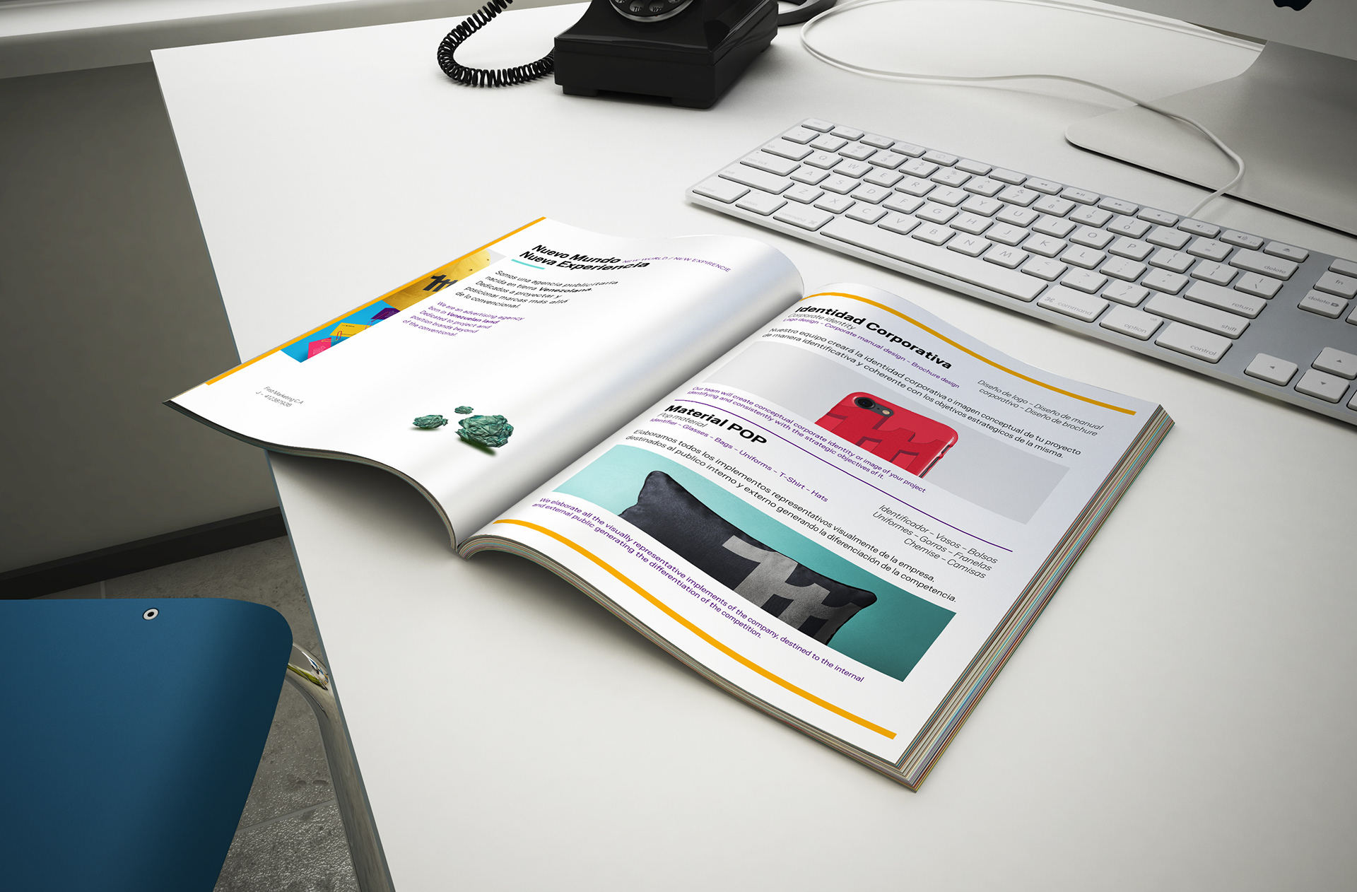
For me, one of my best designs. I enjoyed working with the team, so I achieved a fundamental objective in the project, to send a message.
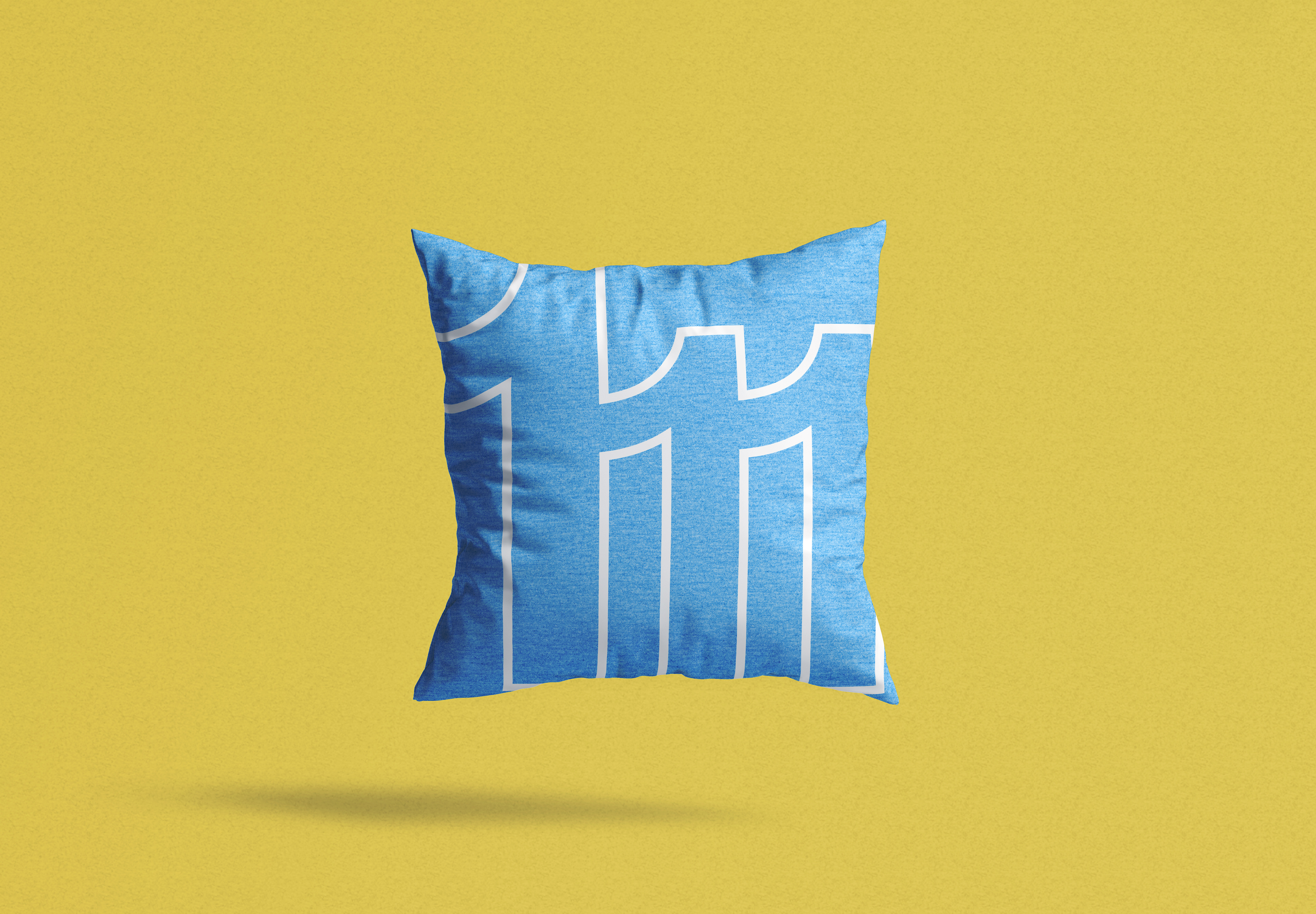
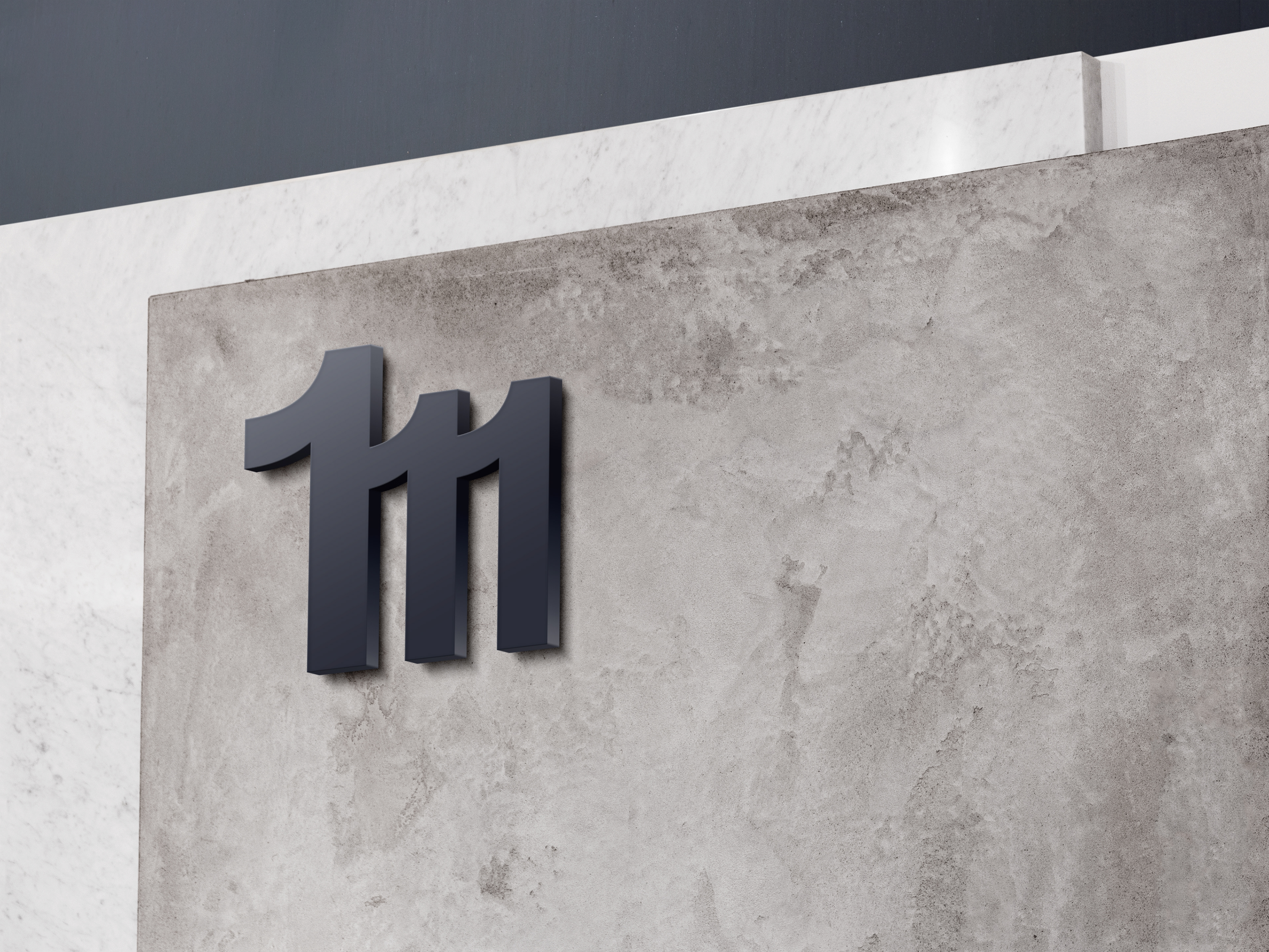
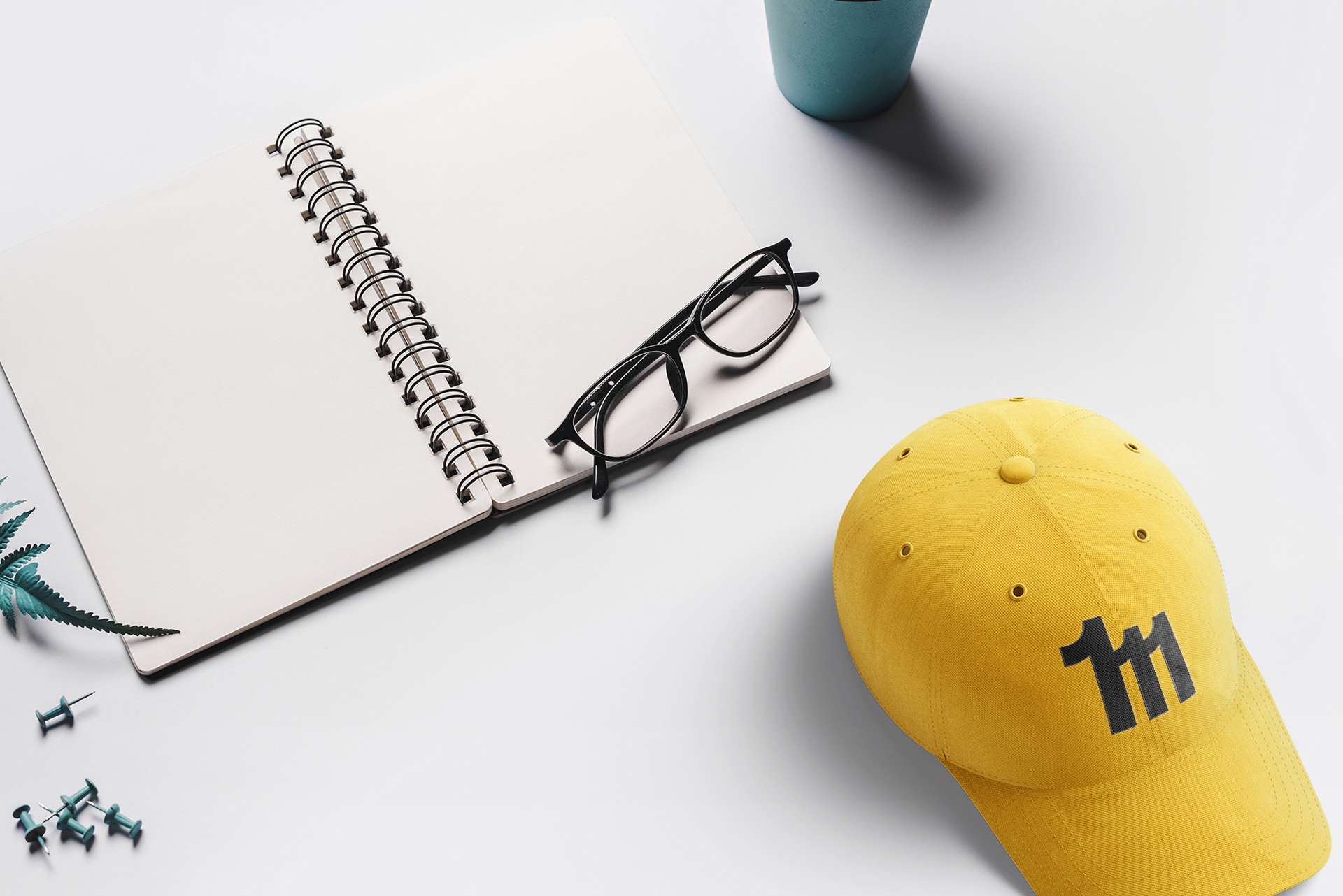
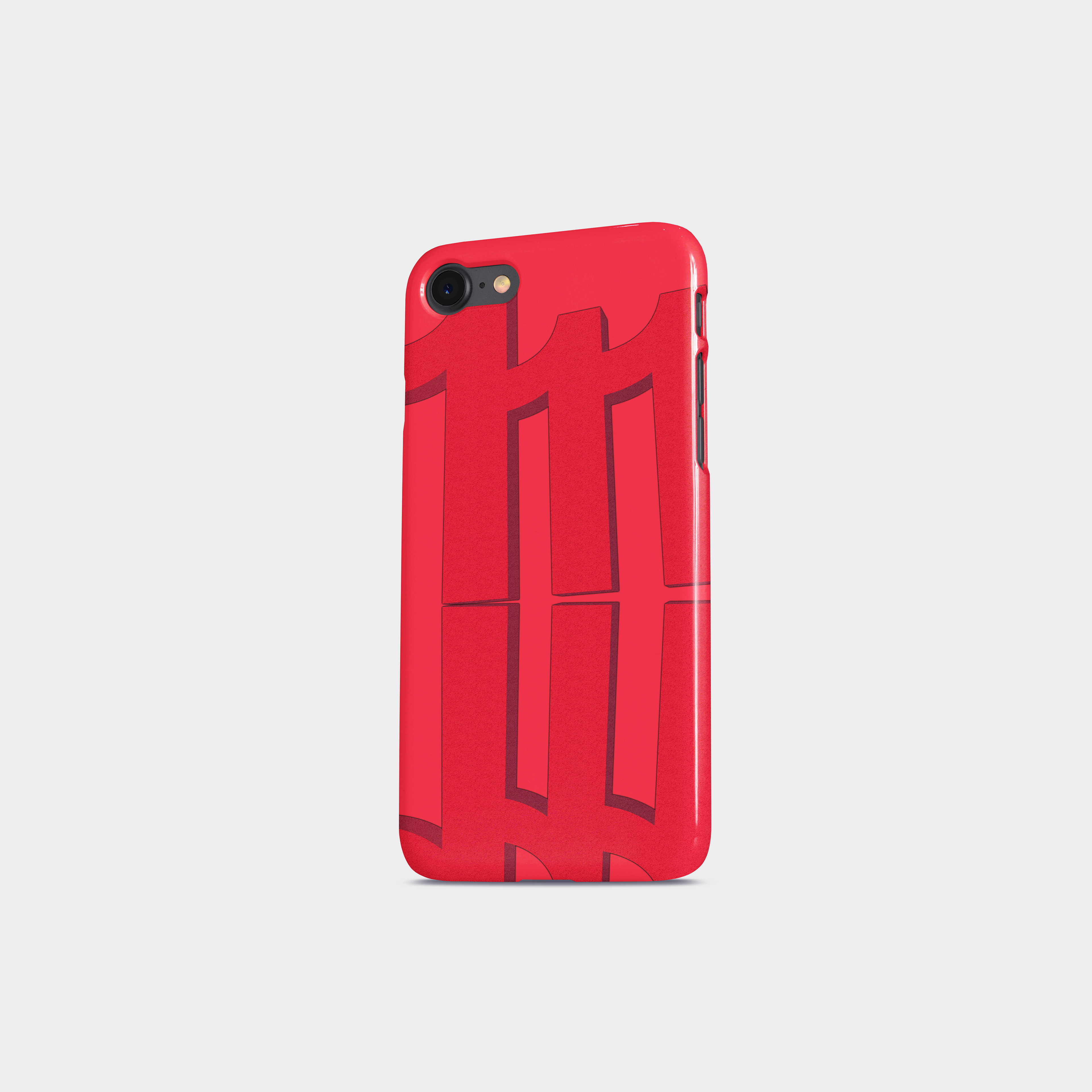
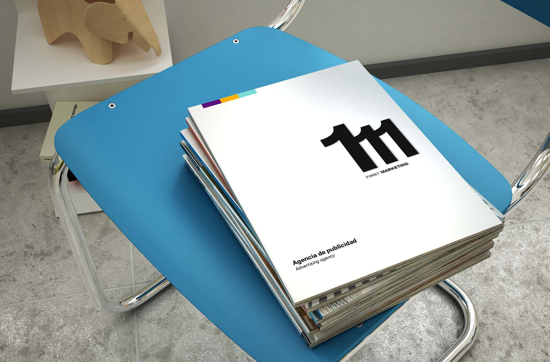
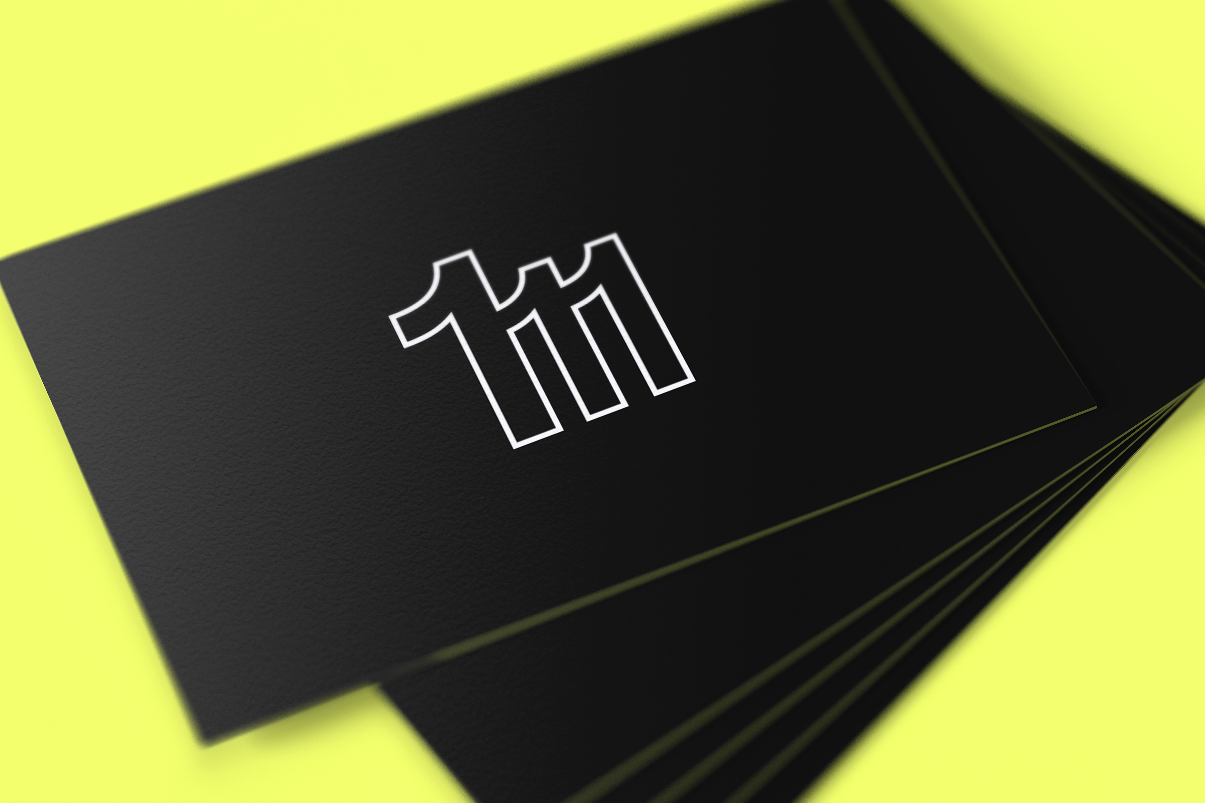
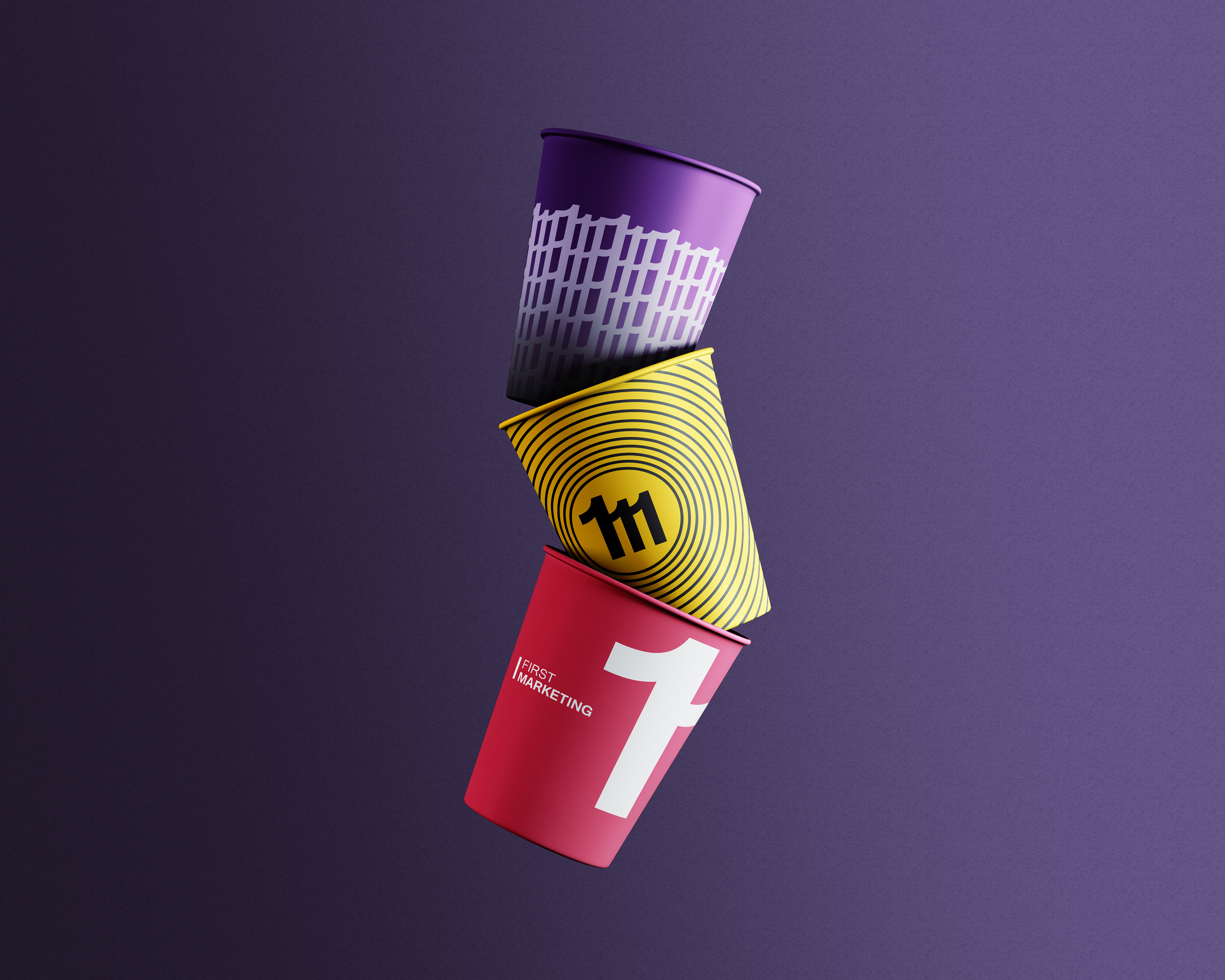
I wanted to present a striking, simple symbol related to the name. The brand name is First Marketing. They wanted their logo to have a direct relationship with their name and to be recognizable at first sight. After several hours of work, I came up with this simple design. A very clean logo with straight lines and curves that accentuate the critical point, which is number one. This number represents everything the advertising agency wanted.
Fulfilling the message they wanted to give, we can see the number one repeated to create the letter M and, at the same time, understand that when we know this number, we are the first.
Thanks for watching and don't forget to rate the project!
All rights reserved ©
All rights reserved ©